The Y2K Style Sheet
Updated 2/19/2021. Note: EVERYTHING IS A WORK IN PROGRESS!!!!
The "Hella Jiggy" Trinity
The Hella Jiggy Trinity are three central pillars that I think define the visual design language of the Y2K era. I call it the "Hella Jiggy" Trinity cause I googled late 90's slang on Google and I thought this would be funny. Here they are!
Neon Colors
You can also call them "flourescent" colors to detach it from the "Neon 80's," but let's face it, the 90's were the 80's: Part II for a hot minute.
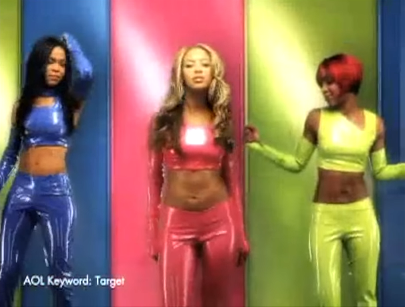
Flourescent / neon colors seem to be everywhere in Y2K. A great example is this screenshot from that video, depicting a Target ad featuring Destiny's Child:

Disregarding the fact that there is an AOL keyword, this ad is so Y2K because of two things: the neon, and the shiny. The shiny I'll talk about later, but for now let's analyze the neon. Each member of the group is wearing a different neon-colored outfit, one electric blue, another plastic pink, and another UFO green, though this one is more yellow-green.

The colors do appear a little muted, partly because of the bad video quality, partly because I just color-picked them into GIMP, but you can still can tell these are pretty well saturated. GIMP tells me these colors are all around 60% saturation. This high saturation makes these colors pop, and gives an intense and fun vibe - the exact opposite feeling of more muted pastel colors that have gotten really popular recently.
And really, that's why these colors were so popular: Y2K was an era of eager anticipation for a new age - 2000! Everyone harkened back to 50's futurism and tried to predict the fashion of a new cyberage; one where the internet was a frequent part of our everyday lives, people looked more alien than actual aliens, and (of course) everyone had flying cars. The neon colors was visual artists' expression of their hope for the future... and so was this next thing...
Chrome
Everything was shiny in this era. If any metal made it onto the stage, it was likely to have a chrome-like sheen. You can see it in Destiny's Child's('s's's) clothes too: the lights shine a glossy reflection on the outfits. The background even has a bit of that sheen.
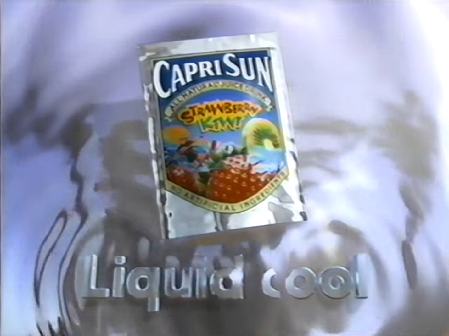
Another example from the video!: the Capri Sun ad in it features T1000 kids having fun while also turning into liquid metal. The ending shot of the ad shows off this (what must have been >$100,000) shiny liquid CGI chrome:

In my opinion, this kinda plays into the out-of-this-world aesthetic a little more... just like 50's futurism! I don't really have much more to say on this right now, but if I figure anything else to say I'll make an update.
Bubbles
Coming soon...
Other Points (that I will expand on later)
- "Neon" can also count as streaks of neon light. I tend to see those a lot in Y2K commerials.
- There is definitely a Y2K font vocabulary. Some people have even made their own custom fonts specifically for Y2K... and then charge money for them. Dam. I gotta find some free fonts that are similar to that whole vibe and talk about those. It might also be cool to find the original fonts!
- Finally... translucent colored plastic needs to come back. Hard. Make the iBook G3 again Apple I dare you I double dare you motherfucker make the iBook G3 again